2025 Data and Divergence Year in Review
As I wrap up my final Data and Divergence of 2025, I want to start with a thank you to readers. This project has always been guided by the same mission: writing and sharing interesting content on political data analysis, demographics, and U.S. elections.
2025 was also a big year for me personally. It marked the end of long chapters at Yale and Decision Desk HQ, and the beginning of new ones at Harvard and VoteHub. When I was five years old, I stayed up all night glued to TV coverage of the 2008 presidential election, reading every number on the screen and begging my parents to let me stay up far past my bedtime. A year ago today, my New Year’s resolution was to put more energy into sharing my work with a broader audience, and in 2025 that effort resulted in 60 million impressions and 2 million total engagements. I am deeply grateful to everyone who has read, shared, argued, and learned alongside me here and on X. Being able to share my passion with others has been incredibly rewarding, and I am excited to see where it leads in 2026 and beyond.
2025 Data & Divergence Year in Review
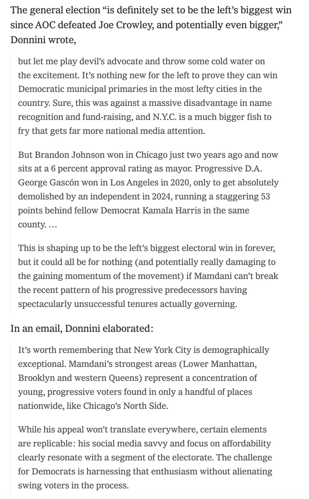
My breakdown of Zohran Mamdani’s shock primary win in June 2025 was among my favorite work this year. His victory in the New York City mayoral race was by far the biggest electoral story of 2025, and as Mamdani’s mayoralty begins at midnight on January 1, 2026, my thoughts below still are relevant. They help frame what may be the central question of 2026: how well does Mamdani actually perform as mayor?
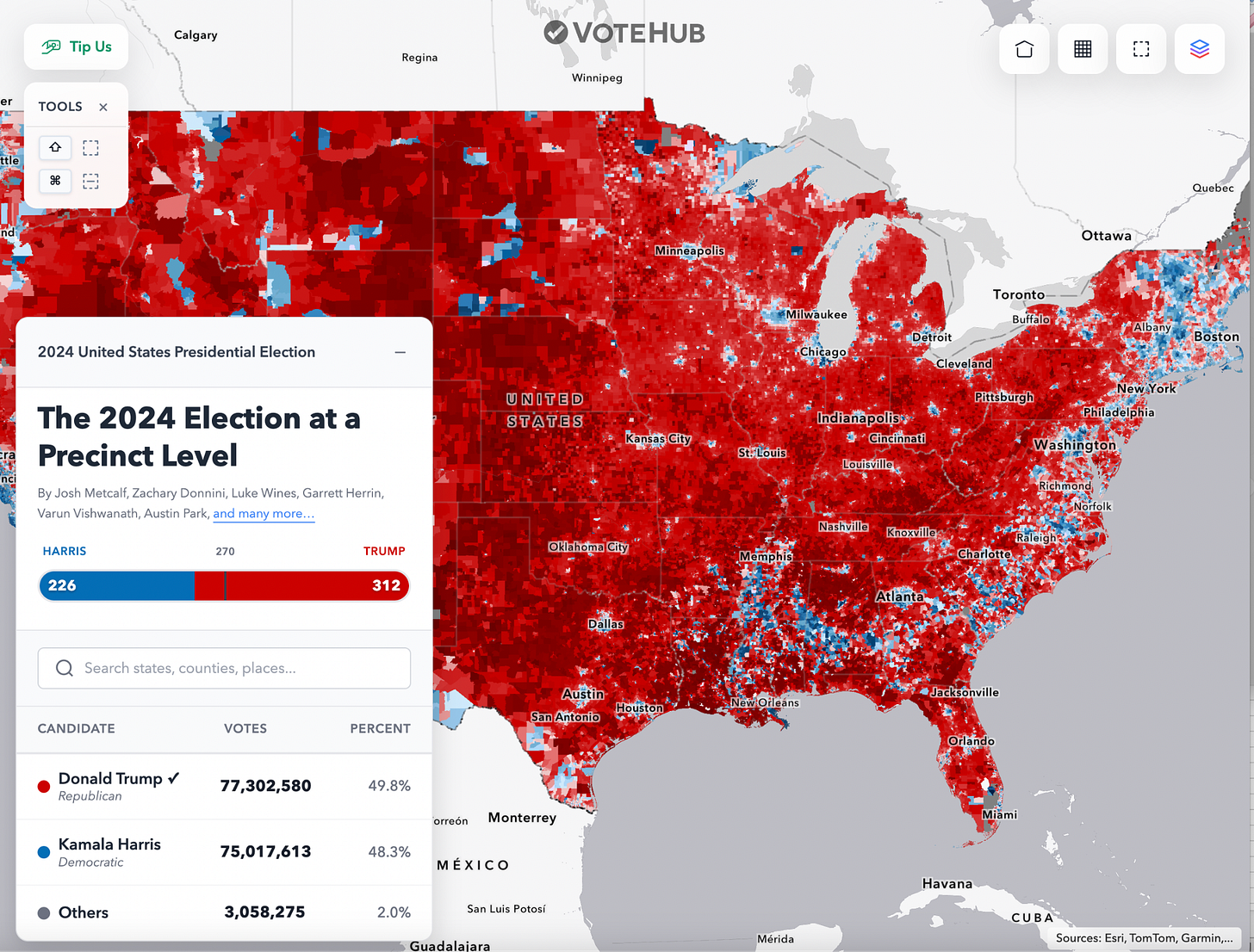
Definitely the coolest project I’ve ever been a part of. It was especially rewarding to fold my senior thesis into something tangible and public. Here’s my guide of how to use VoteHub’s first publicly available, precinct-level estimates of presidential support by demographic on a national scale, and still the only complete national precinct map of the 2024 U.S. presidential election.
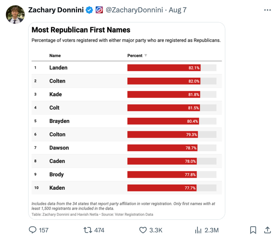
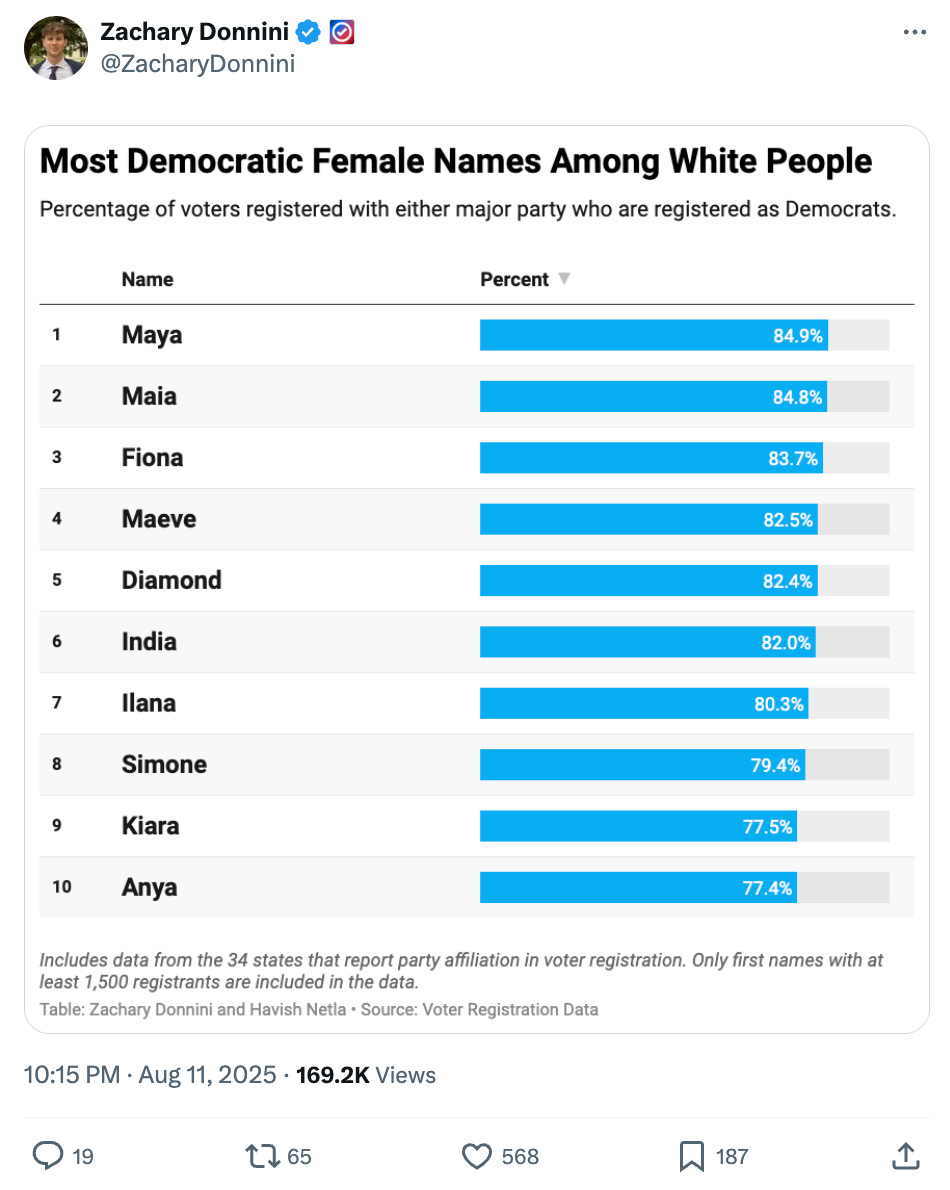
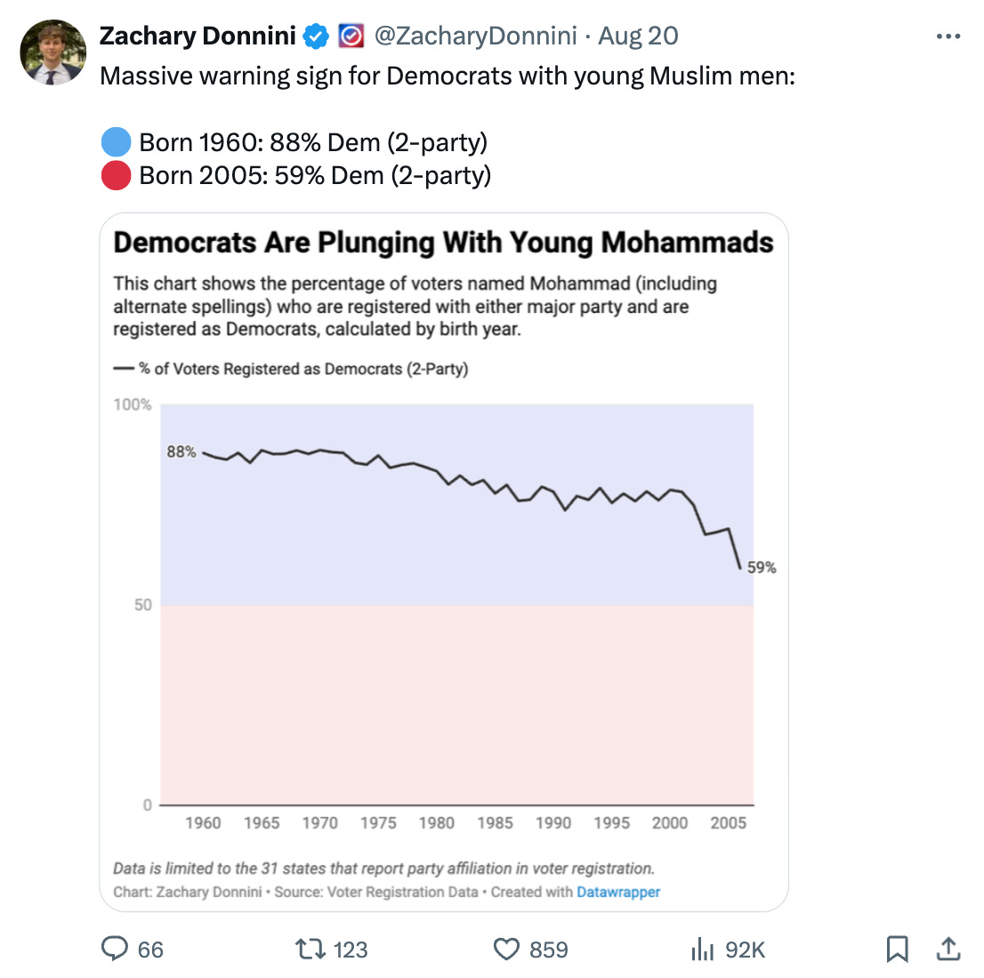
What’s in a name?
With the help of the legend Havish Netla, I also ran a whole series on the partisanship of first names using voter registration data that people really enjoyed. It’s silly fun, but there are also some genuinely interesting takeaways, like how much of the emerging new GOP base is made up of male Zoomers.
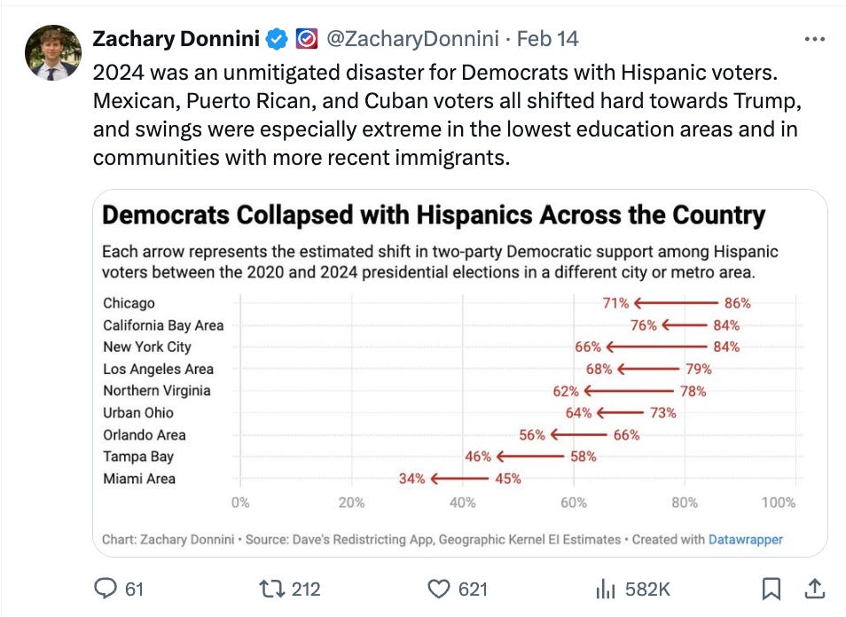
Dems Collapse With Hispanics
The single biggest story of the 2024 election was Hispanic voters’ dramatic shift away from the Democratic Party, and covering it was especially fascinating. It was even more rewarding to apply my senior thesis directly to the 2024 presidential election and see just how large and consistent those Hispanic shifts away from Democrats were across virtually every major U.S. city.
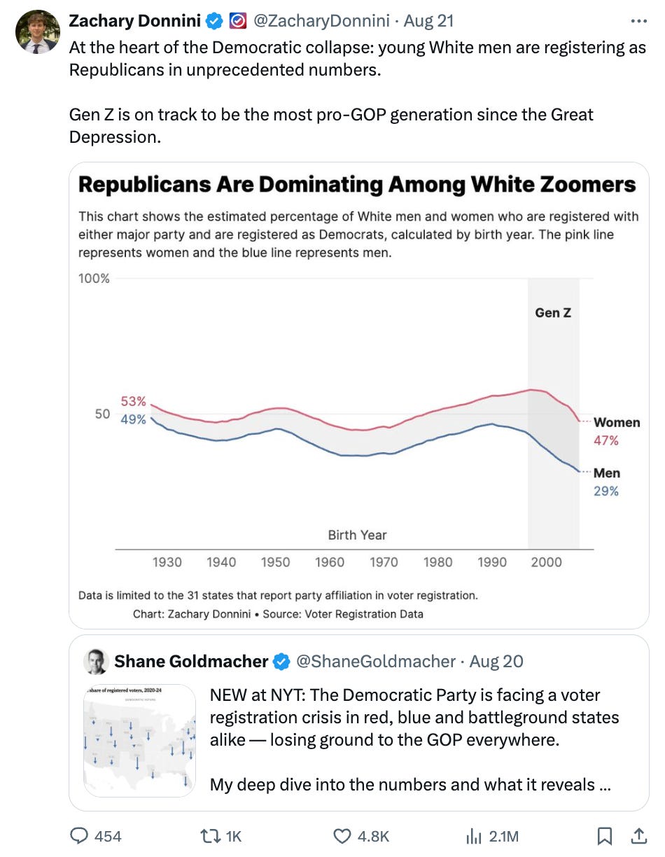
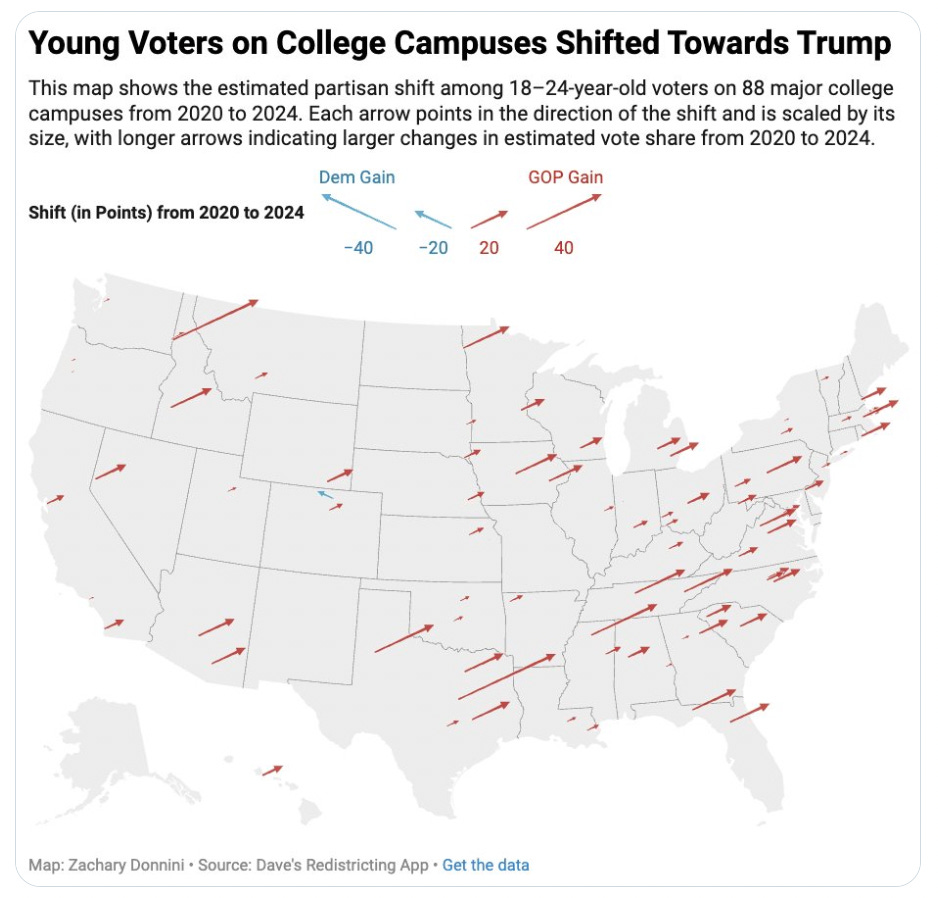
Youth Voters Abandoning the Democratic Party
The second-biggest story of the 2024 election was young voters’ sharp shift away from the Democratic Party, evident across polling, voter registration data, and election results on college campuses. Tracking and covering this trend throughout the year was especially fascinating to me and quite surprising.
Youth Voters Coming Back to the Democratic Party
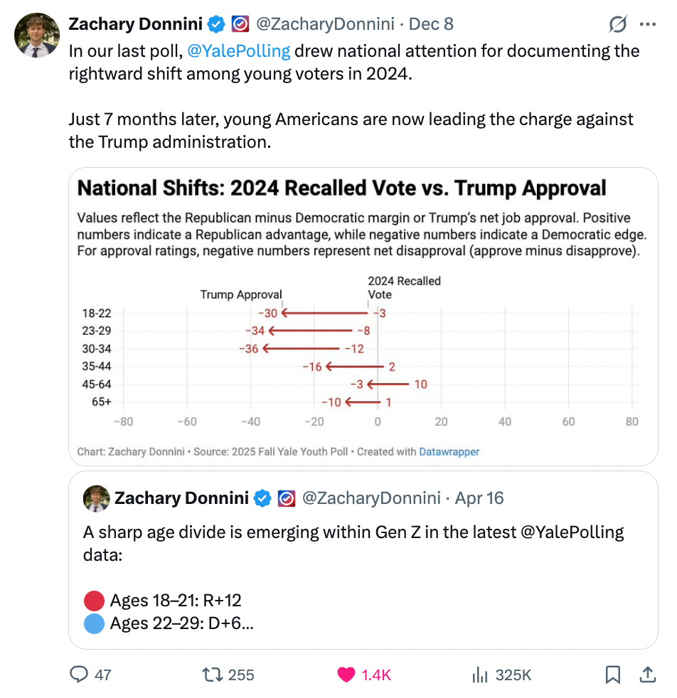
I’ve also focused on highlighting a growing body of evidence, from both polling and 2025 election results, showing that young voters are turning against Trump and Republicans at a striking pace. The gains the GOP made with young voters in 2024 don’t appear to be sticking, and I see this as the second-most important story heading into 2026.
NYC Early Vote Tracking
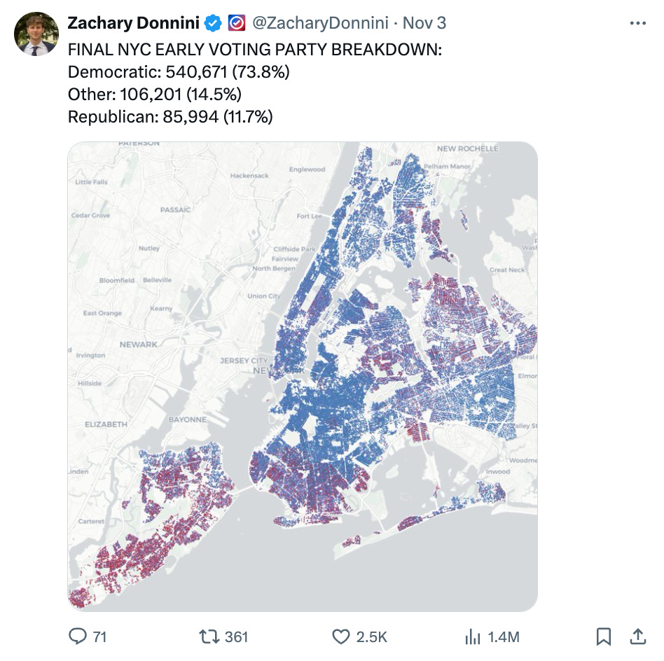
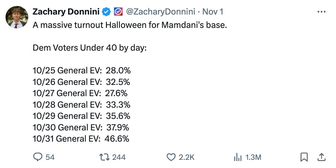
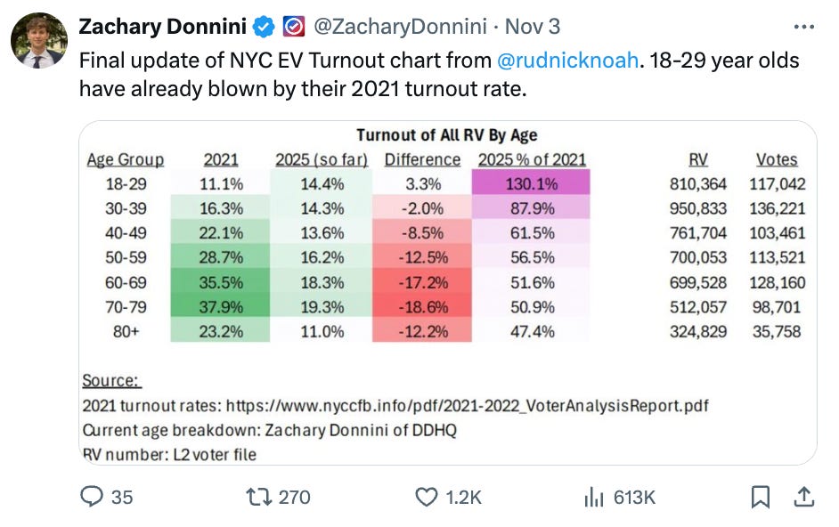
The New York City Board of Elections is outstanding to work with. Every time we’re in touch, they’re responsive, helpful, and generous with high-quality data for analysts. Tracking the massive youth turnout surge and Zohran Mamdani’s transformation of the NYC electorate alongside them was fascinating, genuinely important, and a lot of fun. How often do you see young voters outvote older voters? Almost never. And Mamdani’s campaign may have been the most effective use of social media to mobilize young people we’ve ever seen in American politics. It really felt like the start of a new era and a great preview for the 2028 Democratic Presidential Primary.
Marriage Pact
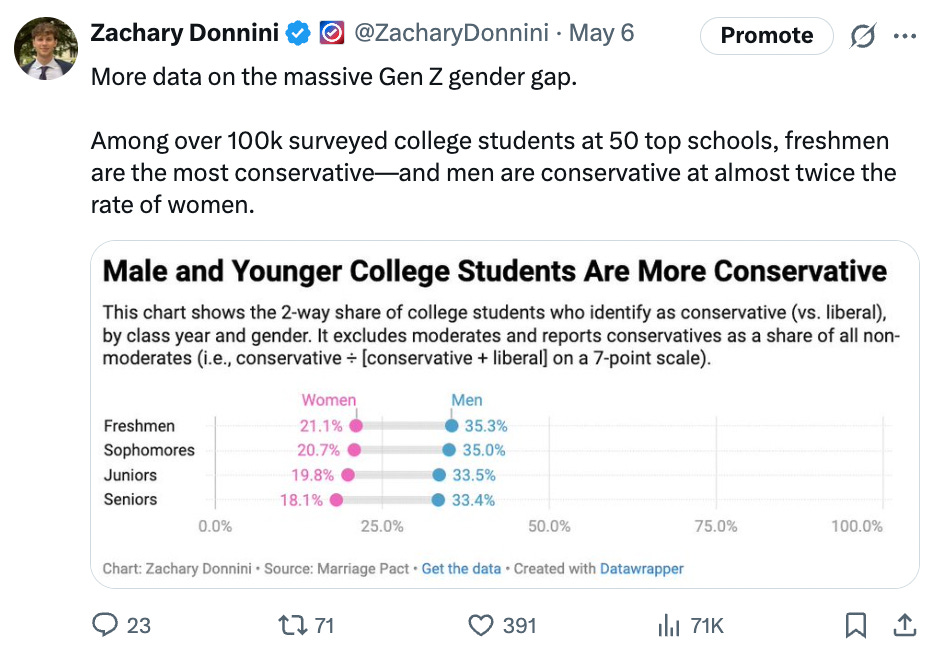
I will always be partial to projects that are fun, creative, and a little off the wall. One example was scraping data from the Marriage Pact survey, an annual matchmaking experiment on U.S. college campuses where students fill out compatibility questionnaires to be paired with a hypothetical future “safety” spouse if they end up unmarried. I pulled data from about 50 schools, including Yale, where many of my friends (and I) filled it out at one point, and shared content based on the results. Was it a randomly selected sample? Definitely not. But as a funny, solid supporting data point that complemented other analyses, sure.
The Starbucks Divide
Another great off-the-wall stat: even after controlling for population density and race, precincts with a Starbucks are still far more Democratic.
Street Cameras
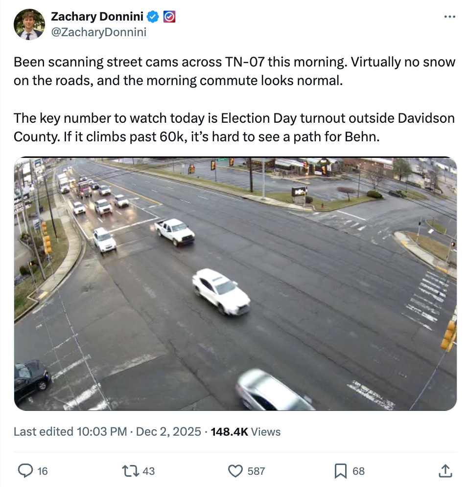
More in the out-of-the-box category: a few weeks before Election Day, I searched for snow across central Tennessee to see how much the state actually got on the morning of December 2, since weather was a real question going into the election. Republican Matt Van Epps needed good weather to boost Election Day turnout, and in Tennessee even a little snow can matter since it rarely sticks and people are generally unprepared for it. Central Tennessee did see some snow that morning, but not enough to accumulate or meaningfully affect turnout.
That’s all for this year. Happy New Years.




Love the work you're doing. I've learned a lot from it. Happy New Year and I can't wait to see what you do in 2026.
PS, thanks for being a subscriber of mine :)